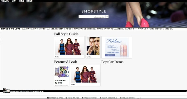
This morning ShopStyle greeted their customers with a brand new look, which is a great improvement on what they had before. It now has a sleek, stylist and current look. The Home Page shows you a section called FEATURED LOOK as well as a new eye catching category entitled BRANDS WE LOVE, this section includes fresh arrivals from some of your favorite high-end designers. The website redesign is now wider, taking up the entire screen on my laptop. The thumbnails also doubled in size, which I find very convenient.
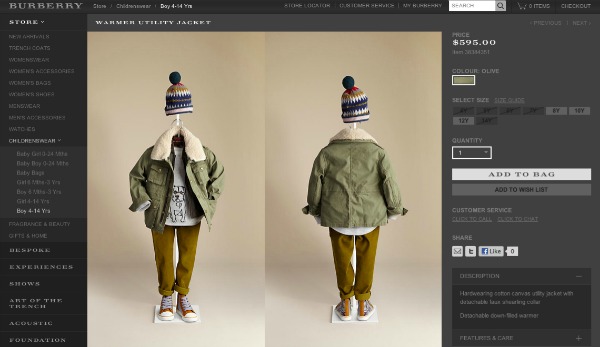
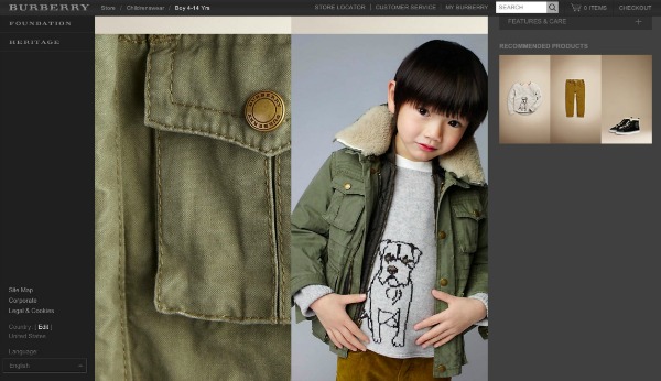
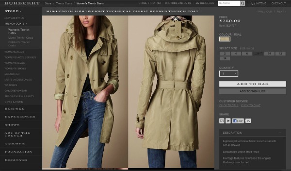
So all in all, we LOVE the redesign. We love that this is a site for unique luxury merchandise and its a one stop shop, you and the entire family. We also liked the nice clear photos of the clothes from all side that look realistic.
Disclaimer: This review was made possible by ShopStyle and Circle of Moms. All ideas and views expressed within this post is solely of Mommy Posh.
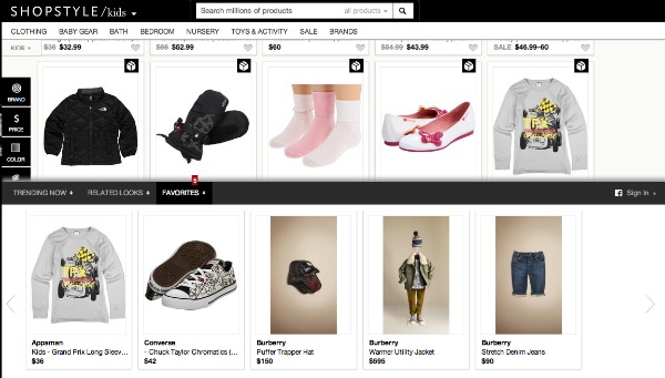
What are you talking about? The redesign makes it harder to do the same thing as before! 1 – More difficult to select brands to filter by, 2 – more difficult to skip ahead to search result 4,000 of 5,000, 3- Men’s size 31 waist isn’t even listed in the search filter anymore!!! It sucks!!!